Remine
REMINE
As employee #1 at Remine, my primary task was to figure out: 'what is this product exactly and how should it work?' The vision of the product was timely and elegant - bringing the power of big data to the real estate industry. But how, in what form, and to whom? These were the questions posed to me, first day on the job. Thankfully, I was up for the challenge!
User personas I developed for the project.
Problem
The first problem that needed addressing involved product direction and the creation of requirements and spec documentation. Because the product was so early in it's development cycle, I focused on clarifying what it needed to be, what it should do, and who would be using it.
After these problems were solved, I began addressing the information architecture - what information should go where, and when - then moved on to workflows. From this followed wireframes, creating a style guide, fleshing out the wireframes into high-fidelity mockups, and then onto prototyping.
But one thing at a time...
Process - Step 1
It all began with two things: creating product requirements and user personas. Working closely with the company principles, I was able to distill the product into several written requirements documents, and from there jumped into defining the web-app's user personas.
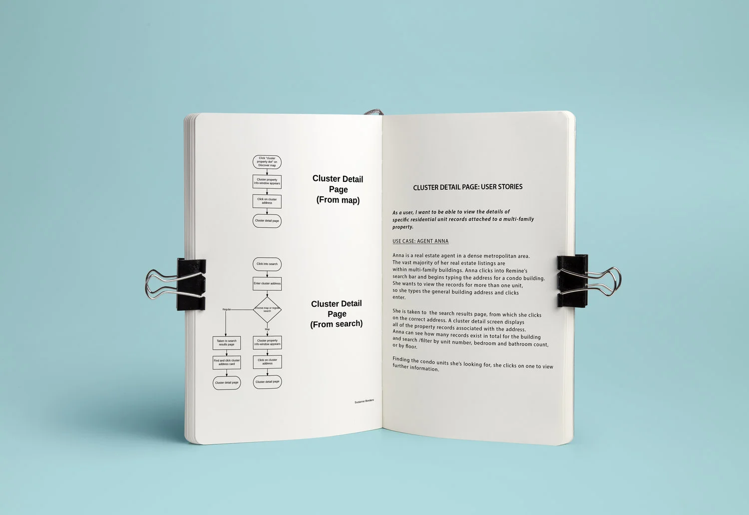
Next, I began gathering the information points that would need to be included in the app, and started organizing the information in a way that would make sense to users. During this process, I also began identifying and documenting the app's primary workflows. This came in very handy when I was working through how to break down the information by screen, and determining where content should appear within the app.
Since the product was primarily a web-app desktop experience, I allowed for more than one focused task per screen. This lead to less, but more complex screens, which in turn necessitated a lot of wireframing work. The goal was to ensure that even within a single screen, the information was organized correctly with usability front of mind. User stories helped greatly with this process, and I began writing them for each screen and workflow.
Version of the 'purchase contact info' workflow.
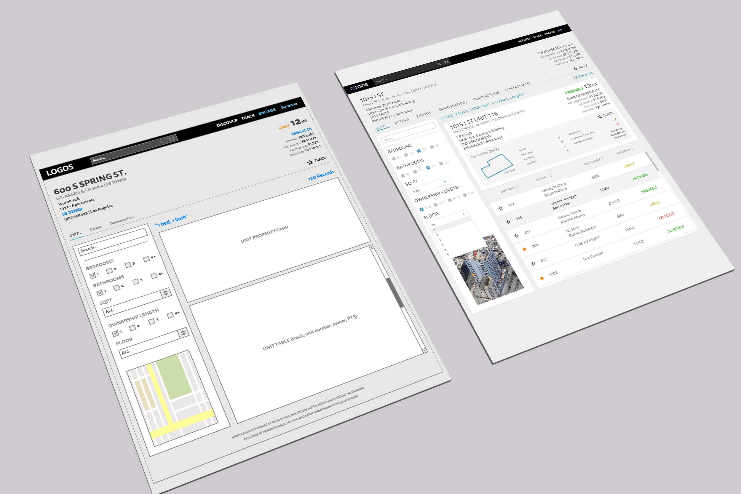
Early, early stage wireframe for the 'property detail' page.
process - step 2
After getting a handle on the IA, product, and personas, I began to heavily dive into wireframing. Since there were not many screens in the app but each screen was very complex and dense, I had to be very thorough with the wireframes to ensure all data points were included.
Thinking with usability front of mind, all of this information also needed to displayed in a visually useful and compelling way. That was no easy task!
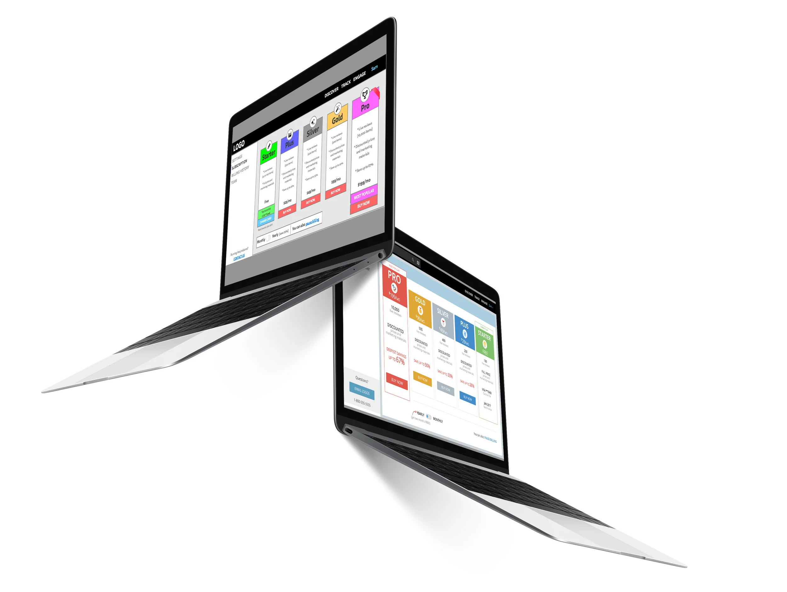
From the wireframes, I began the process of fleshing the designs out into high-fidelity mockups. At this stage I also developed a visual style guide for the product, and standardized UI components like dropdown menus, buttons, iconography, etc.
To see some examples of this style guide (and other internal documentation, such as workflows, user stories, etc), see my "documentation" portfolio entry.
Process - Step 3
One of the screens that was heavily user tested.
After the mockups were complete, I began the process of creating a high-fidelity prototype. My goal was to put it in the hands of users to get feedback, leading to rapid iteration, with the goal of quickly fixing any usability issues.
With this feedback, and with feedback from the other team members and principles, I was able to perfect the designs. After everyone was happy, I was able to begin the developer handoff process.
Once developers entered the process, I worked closely with them using JIRA and Slack. I gave direction and insight into various questions that arose, and tasked them with work related to building the product. At our largest, I was managing a team of 7 developers and 1 visual designer!
At the end of this process, we were able to successfully build a product that was launched to over 100,000 real estate agents!
LESSONS LEARNED
I learned a lot from my experience designing and managing product for Remine. From the early to late stages, there were always new challenges to overcome.
- Cognitive limits - users can only store up to 6/7 pieces of information at any one time. Therefore you must keep lists short and manageable.
- Cards are an excellent and preferable replacement to tables in most use cases.
- Always keep room open for technical limitations - great usability doesn't always come from design, but also from good avoidance of technical issues, like long loading times.
- Good sorting and filtering is key to usability when it comes to large amounts of data!
- Contextualizing information is important - small UI features like breadcrumbs can really help keep users oriented.