Osurv
OSURV
My job at Osurv seemed simple - make mobile surveys fun! However, this turned out to be far more difficult than expected. Back then (2013) not many people believed in mobile as a platform, and even fewer believed that people would complete surveys on their phones. As I joined fairly early in the company's history a lot of my work centered around clarifying the product, rapidly building prototypes, gathering user feedback, and applying it towards the goal of justifying design decisions and product direction.
Conducting some user research.
Problem
Joining the small team as the only UX/UI designer, I had to quickly acquaint myself with the product and address immediate challenges, such as lagging user engagement, cross-platform mobile design issues, and lack of user testing, feedback, and research. Additionally, the company needed assistance with product direction.
It appeared to me that user feedback and research were going to play a huge role in my job, at least initially. Using local tech meet-up events, I was able to conduct a lot of free or low-cost user testing. After gathering the results, I was able to analyze them and deliver insights into the situation and began to formulate a plan of attack!
process - part 1
After gathering all available information, I was able to begin to outline various parts of the product and define the primary workflows. Since the product had two sides - the survey taker and the client dashboard - I created two separate personas to address each interface from a different perspective.
Additionally, it was key to consider the survey taker's total experience - where they would encounter the survey in real life, how they would engage with it, what time of day would they be taking the survey, etc - as these factors not only affected survey completion rates and outcomes, but also affected the digital survey-taking experience. Part of the product was positioning the user's exposure to the survey, and I was responsible for figuring out where that positioning should be. For this, storyboarding helped a lot, as did creating comprehensive user journeys.
Storyboarding the survey experience.
Whiteboard wireframes.
Process - part 2
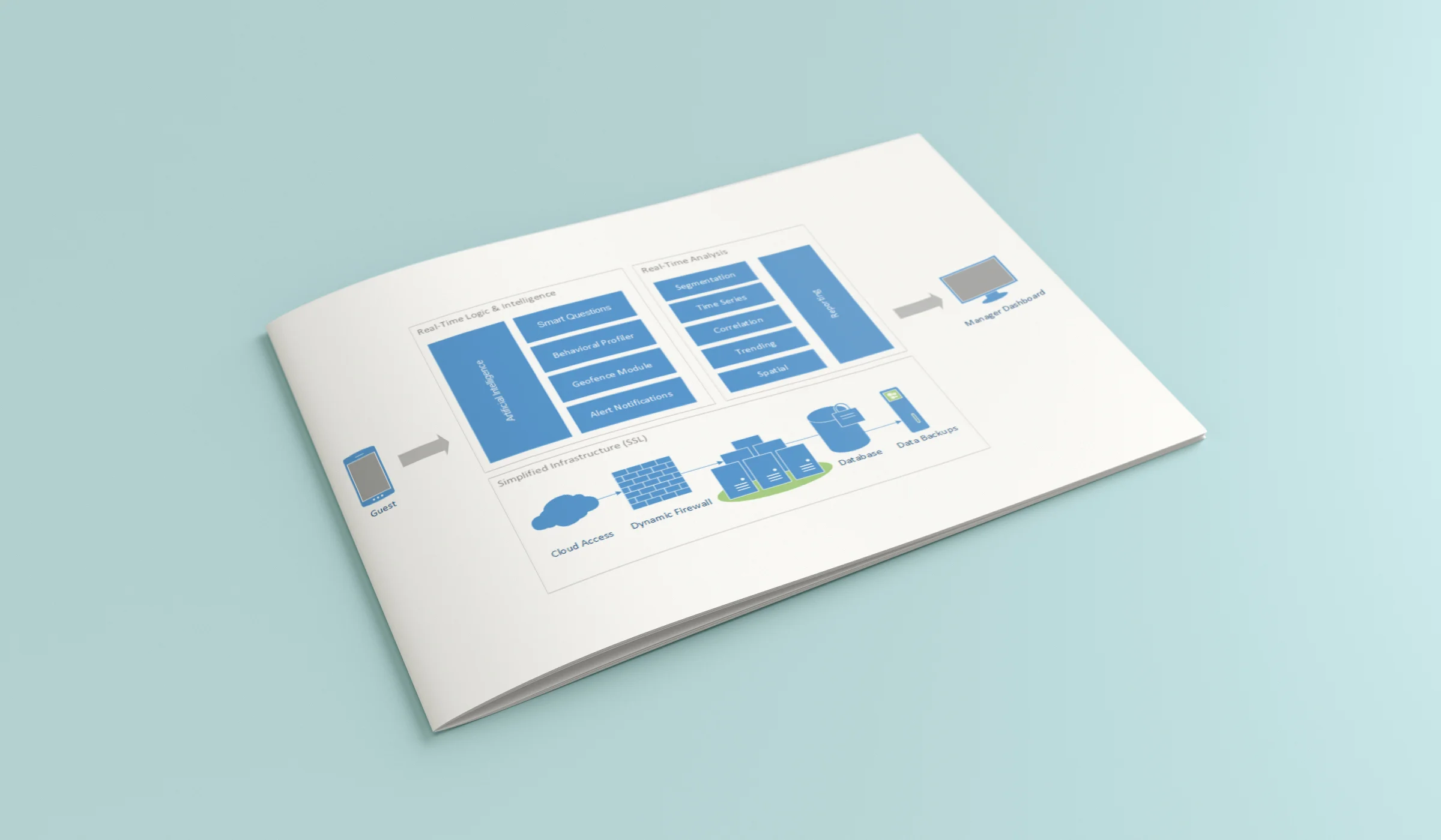
After getting a handle on the product, I moved on to documenting the product's workflows and overall information architecture. I did so by creating workflows and sitemaps, which helped also further define the product.
After this came the wireframes! A lot of time was spent in front of whiteboards, wireframing out the mobile survey experience and the client facing dashboard. I went to great effort to find comps, and to seek out survey experiences in various parts of my life to analyze them for clues about what worked or didn't. Additionally, I continued to get feedback from users as much as possible.
Mobile survey showing tiled UI design.
Process - Part 3
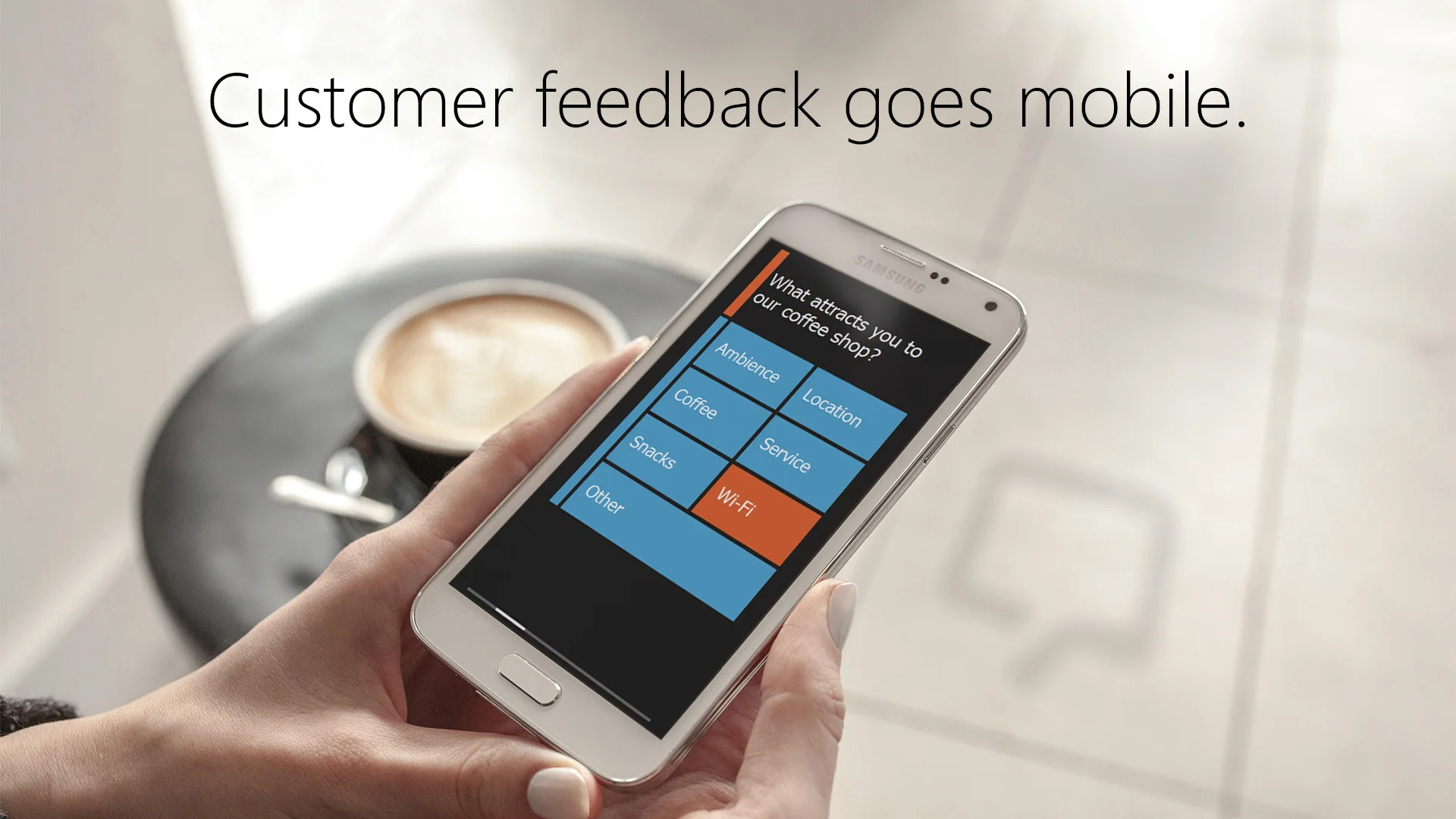
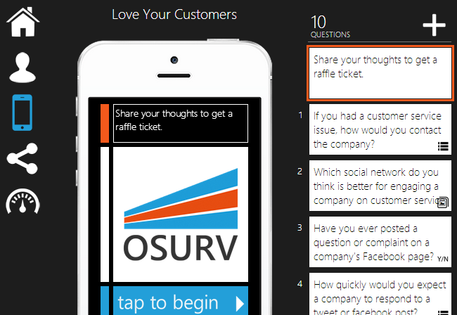
From the wireframes, I began the process of fleshing out the UI for the product. Wanting to keep the mobile interface as clean and simple as possible, I searched for ways to design an interface that eliminated items like dropdown menus, radio buttons, or checkboxes. I came up with the idea to create labeled tiles that served as answers to survey questions, so users could easily 'tap a tile' to answer a question, vs struggling with tiny UI elements that weren't optimized for the mobile experience.
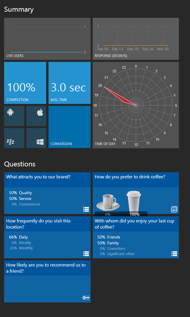
Went through several iterations of the client-side user dashboard, attempting to find the best way to communicate large amounts of survey data. After playing conceptually with the idea of a car dashboard, I settled on tiles again, and found a way to construct square pie charts, to fit in the with rest of the dashboard design.
Testing an early version of the client-side dashboard tablet experience.
Solution
After several passes at the UI, I yet again set the product in front of users to see how they felt about it. Additionally, I continued to mine local tech events and meetups for willing and low-cost user testing groups. From this research, I was able to perfect the shade of dark grey I used as a background color, which incidentally happened to be the exact same shade of dark grey Microsoft used for the background of Windows 10! They must have performed the same user testing that I did - and got the same result! :) I felt quite vindicated with that one!
Since running surveys was quite easy, I was able to iterate quickly on the designs and allow users to play with it easily. The dashboard was harder, but I was also able to put prototypes and live versions in front of user groups to get feedback.
Lastly, I bought a ton of various different phones and manually performed tests to ensure that the experience and visual design was consistent across mobile platforms, and wherever it wasn't, I made a note to the development team or myself to find a solution.
By the end of my time at Osuv, my designs and UX work had increased the completion rates for our surveys by 20%, and upped the CTR as well!
Casio's ad for our Osurv survey - a wonderful moment!
Takeaways
Working at Osurv, I learned a lot about designing for all sorts of mobile platforms. Some of the wisdom I gathered is as follows:
- It was very true at that time - and somewhat less, but still true now - that mobile experiences vary based upon platform, and the key to usability is to anticipate, design for, and test for every possible platform experience, and optimize accordingly.
- User's attention spans are very low on mobile, and if your UI requires them to tap or swipe multiple times to accomplish a task, they will just abandon ship. People's fingers are small and users are clumsy - don't make the task you're asking them to do harder to perform that it already is!
- Don't try to reinvent the wheel. If there are established best practices, use them. If a style has been proven to work, go ahead and take the short cut and adopt it. Definitely justify and verify all your design / usability decisions, but don't go out of your way to re-create designs / practices that have already been proven.
- If in doubt, ask the user. If the user is in doubt, ask a group of users. Test, test, and test some more!
Lessons Learned
Some of the things I'd do differently, if I had the chance to do it again:
- Incorporating animation. At the time, not a lot of mobile apps or experiences incorporated animation, and as such, I didn't think to bring it into the Osurv experience. However, it would have been a valuable for many reasons, and I feel like it could have additionally increased engagement.
- Emojis - similar to animation, it would have brought an element of playfulness and fun to the survey process, and would have likely increased engagement while performing a process many people find unenjoyable.
- Gamification - again, not common at the time for mobile experiences, although in hindsight adding an element of gaming into the mobile surveys would have likely appealed to users and even to clients, on the dashboard side.